AN EXERCISE IN SIMPLICITY
LIFELOCK VOICE ASSISTANT
Foster user engagement and delight through conversational touch points
LifeLock (AKA NortonLifeLock) is a consumer cyber safety product focused on identity and privacy protection. I worked with the product team to build a voice-app (Alexa skill and Google Action) to expand the product touchpoints with customers and increase casual user engagement.
*This product was built as an Alexa skill and a Google action. For consistency, the visual UI in this case study is of the Google action.
A NEW ACCESS POINT
OVERVIEW
User engagement with the LifeLock service is key to proactive care of online privacy, awareness, and in turn, retention. The project’s objective was to create a new entry point to LifeLock by expanding from web and mobile to include smart assistants like Alexa and Google Home Hub, leveraging the use of natural language in a casual scenario to access the most needed features of the service.
The translation of mobile/web interaction models to voice presented unique challenges and provided insights into how users approach the product.
GOALS
- A new approachable entry point to interacting with LifeLock
- Increase engagement and value awareness
- Add personality and a tone of voice to the product brand
MY ROLE
Design lead, voice-UI, and visual interaction design. Research and usability testing. Deliverables: journeys, mockups, and design specs.
DISCOVERY
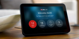
HOW TO INTEGRATE WITH A LIFELOCK MEMBER’S DAILY ROUTINE
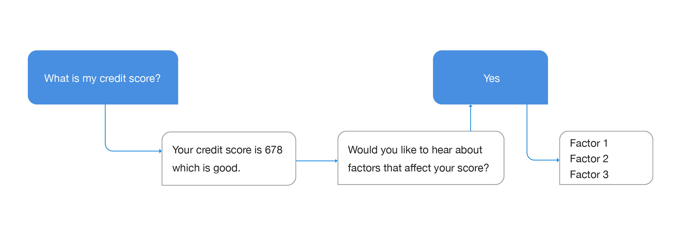
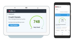
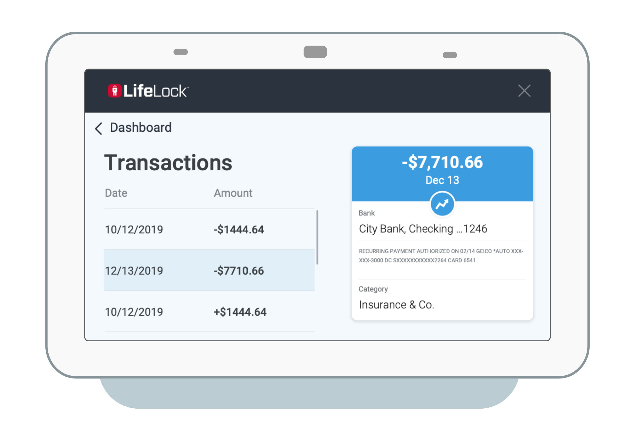
Customer insights showed that the main drivers for engagement are urgent alerts and a routine “sanity check” of credit score and bank transactions.
A voice-app should be a concise and minimal version of the product and work well with the limited depth typical to voice commands.
Data insights and qualitative user study helped define the most viable product areas that users would seek in a voice app and set out to create simplified instances of these features.

A map of the four key features as a minimalist journey with voice entry points and follow up touchpoints in the core product.
CROSSING OVER TO THE MOBILE APP
The goal of a voice assistant is to provide an unmediated entry point rather than redundant with the core product.
It was essential for the content and functionality to match the succinct level of a voice-app. Experiments and testing indicated the point or number of steps where users would reach out to the main LifeLock app to complete a task or get more information.
The consistent guiding question was, ‘How far can we take the navigation and task complexity before driving users to reach out for their mobile devices?’
Task-based dialogues typically conclude after 2-3 exchanges. Users can follow and comprehend lists with up to 5 short items.
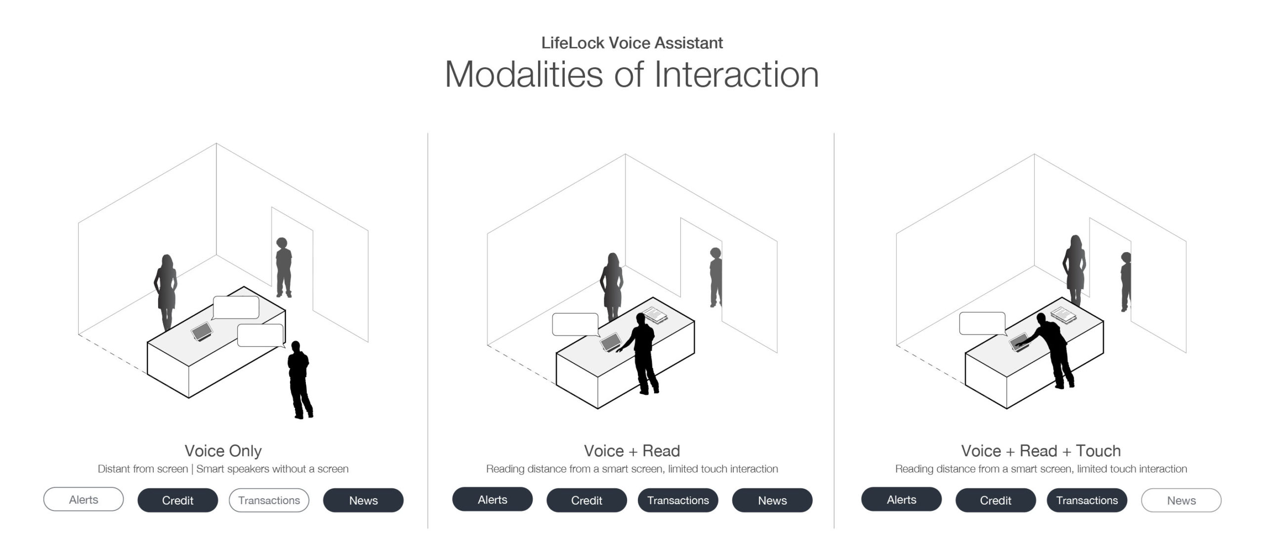
USE CASES AND MODALITIES
A use case matrix helped prioritize the depth of each feature and how frequently it is accessed.
To assess the depth of conversation flow and visual density we looked at three typical modalities of interaction for each use case.
Use case matrix

Interaction modalities
FRICTION POINT – SIGN IN
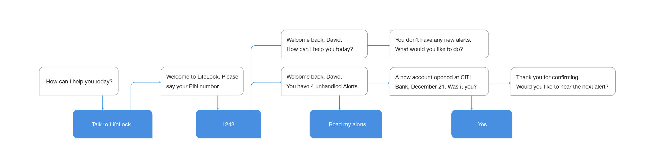
Given the sensitive nature of the information that LifeLock protects, the sign-in flow must be handled carefully. To overcome this friction point, users first link their accounts and create a passcode when activating the voice app for the first time. The passcode enables secure authentication without the need to dictate long passwords.
INVOCATION AND AUTHENTICATION
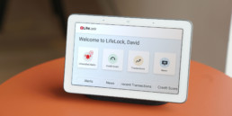
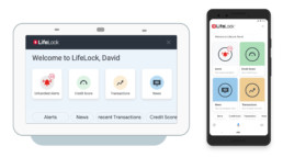
Once the account is linked, members can then use a direct invocation to start the action or skill and access all its features using voice and touch UI when available.
The experience is designed to provide full functionality for screenless smart speakers and smart screens alike.
REDUCING NAVIGATION FATIGUE
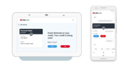
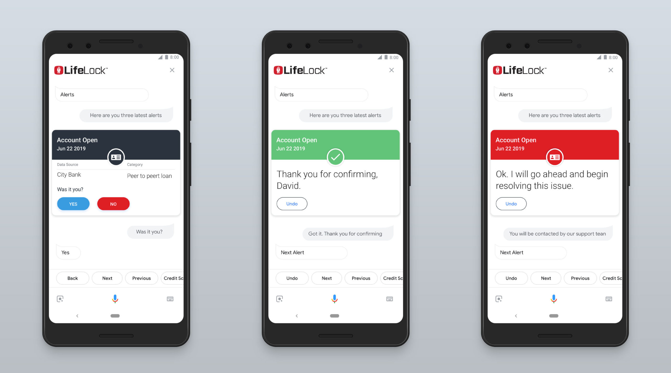
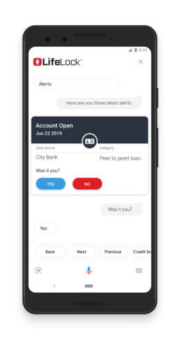
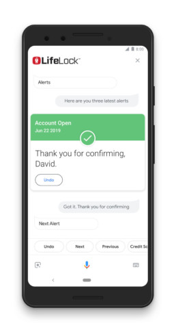
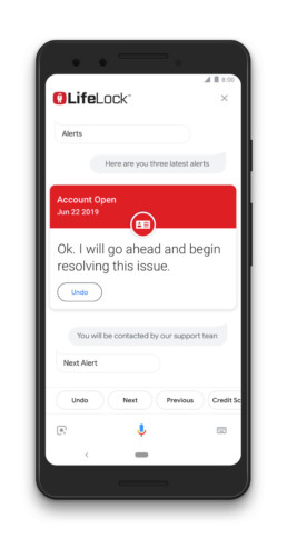
Completing a task such as browsing and resolving alerts requires going through several steps and moving between different views. In voice UI, navigating between a list view and a detailed view can cause disorientation and cognitive overload. To simplify this task flow, I eliminated the discrete list view and merged it with a card view that features the whole task flow, without the need to move between screens. In the voice-only interaction, users directly go through each alert at a time in chronological order.
Alerts - initial flow with three steps navigation

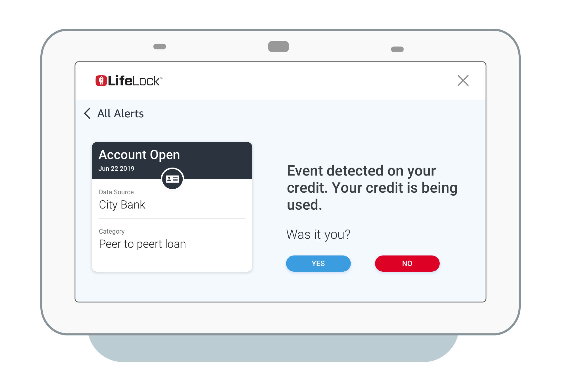

The Consolidated view keeps the task flow in one step, for voice and visual UI.

Alerts resolution - mobile view
Alert resolution - mobile view
CONCLUSION
Integrating the voice app organically into an established product ecosystem required balancing functional and visual consistency with custom solutions. Designing for voice-only first and addressing the hardest constraints was the main challenge. Once the visual and touch UI started forming, it also informed voice-only design decisions.
Voice interaction is still at its novelty stages, and integrating this dimension to the product fostered a sense of fun and value to the routine engagement with the product.
Year: 2019
Company: NortonLifeLock (prev. Symantec)