JOHNSON & JOHNSON
CONNECTING GLOBAL COMMUNITIES
Connecting a global community around uniting ideas and values through narratives and experiences - the J&J heritage museum and responsive website act as one entity with two access points

I led the design for multiple web-based, mobile and physical experiences for Johnson & Johnson’s onsite and online heritage museum. I collaborated with a core team of designers, PM, content strategists, and developers, as well as client-side teams of marketing, strategy and IT.
The project required a holistic approach to designing mobile web apps that scaled up all the way to large-scale digital exhibits with custom hardware and multi-user, multi-screen interaction.


EXPERIENCE GOALS
Connect diverse global communities of J&J (Johnson & Johnson) employees through the company’s 150 years of history and core values.
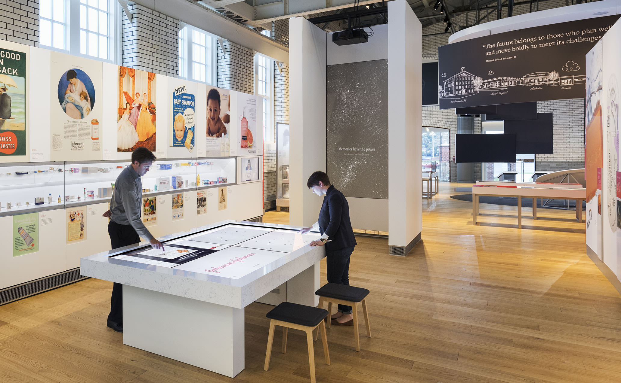
The museum features stories, artifacts, and live visualizations through two entry points; A historical museum building located at the global headquarters in New Jersey and a responsive website that is open to the public and serves the very same content through rich experiences and narratives.
CHALLENGES
Designing and deploying a website with dynamic content alongside a set of digital exhibits and installations that share the same interaction models and draw from the same CMS.
Working with a corporate client, adhering IT protocols, brand, and legal guidelines.
Working with a remote developers team.
Timeline - mobile web and multi-user touch table
MY ROLE
I collaborated with a cross-functional team of designers PM and a tech lead. Additionally, I supported an agile development team throughout production and launch. I also worked closely with multiple legal and IT teams at J&J to ensure compliance with their corporate guidelines for testing, implementation, and security.
Deliverables: UX research and strategy, flow and user journey maps, content strategy, information architecture, wireframes, feature sets and motion samples, prototyping and user testing.
APPROACH
I conducted a research phase to synthesize the content requirements and user data. Understanding users interests and catalysts was critical to creating a sense of emotional connection and inclusion for J&J employees worldwide.
The research findings guided design decisions as well as content strategy, the tone of voice and visual presentation.
I paid attention to usage patterns of mobile web that allowed the digital museum to feature deeper content and rich narratives.
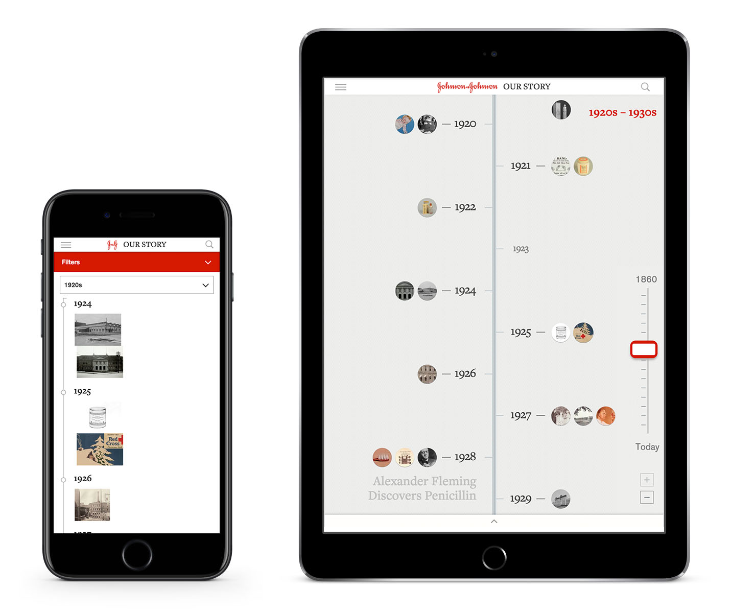
Archives - web and onsite touch screens


THE DIGITAL MUSEUM – WEB EXPERIENCE
The web-museum had to be integrated into the ecosystem of the J&J brand and web properties. Early design discovery featured a unique visual approach to navigation and content presentation. When moving into production the requirement was for more consistency with the main J&J website and brand. The solution was a hybrid approach, where site-wide navigation elements are consistent with the J&J guidelines and experiential areas of the site such as the timeline and interactive map utilize custom UI patterns and content delivery that align with their onsite counterparts.
Content Model

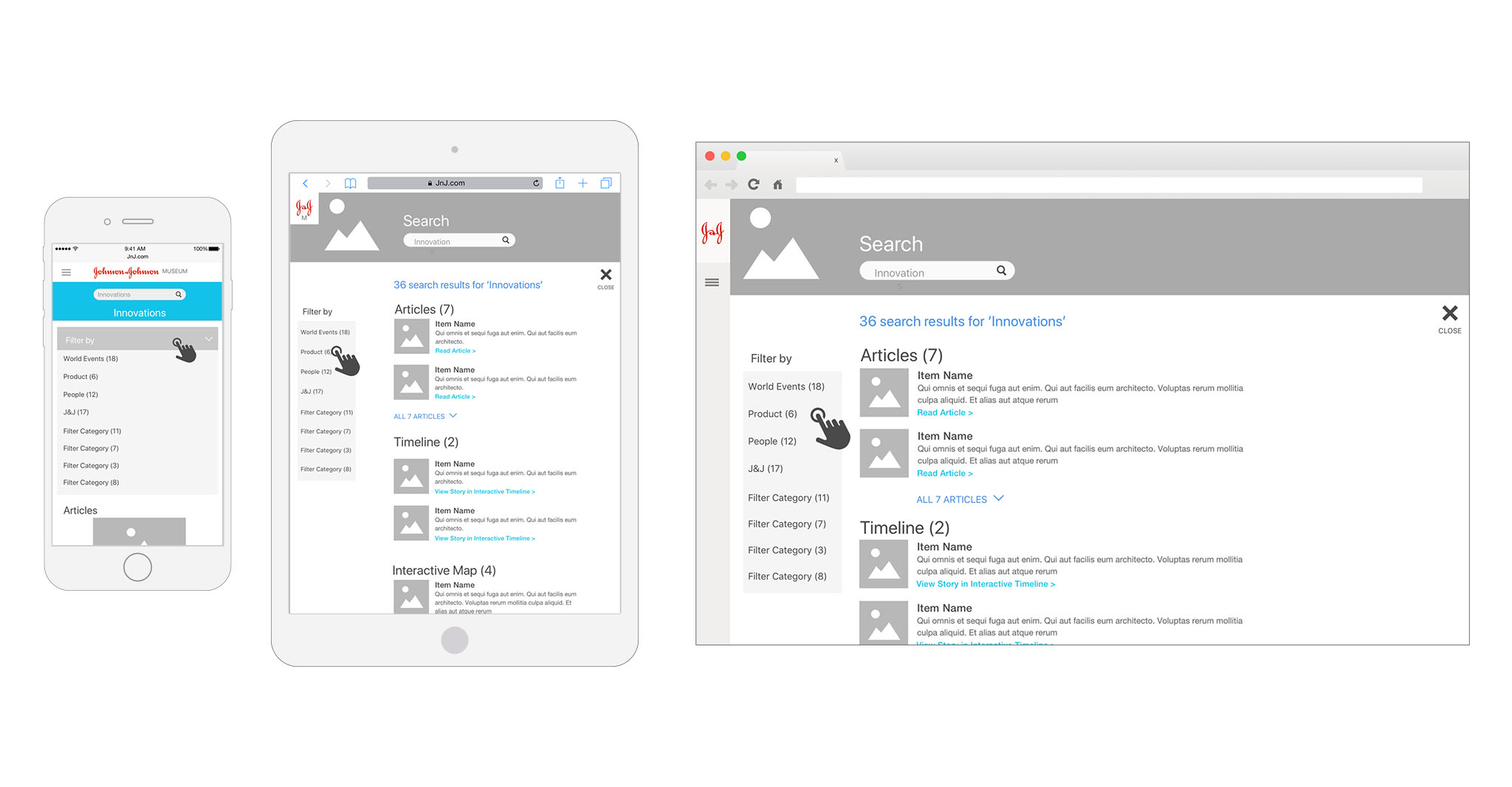
Online Museum - sitemap, task flows, and search functionality


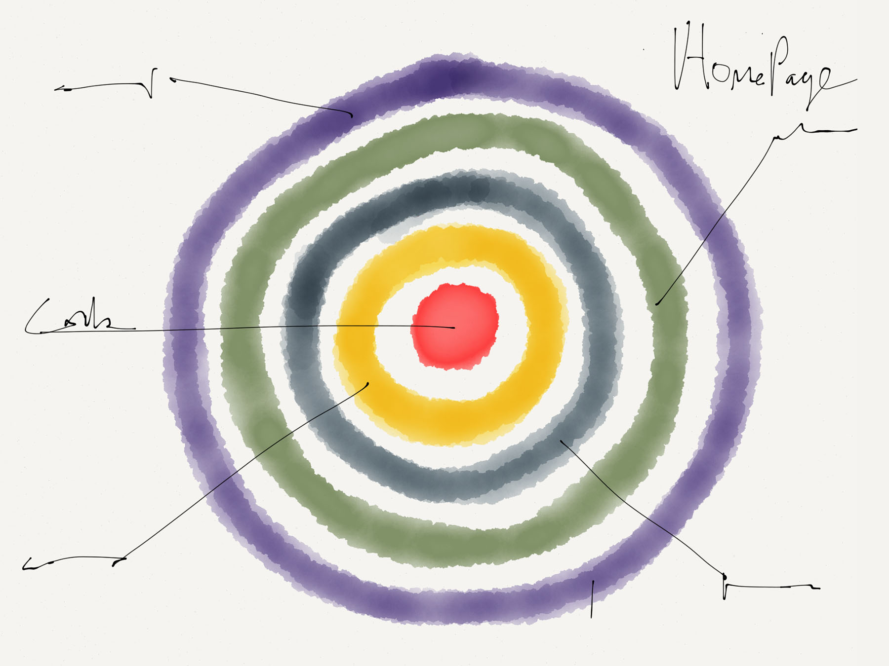
Homepage early sketches


GLOBAL COMMUNITY – CASE STUDY
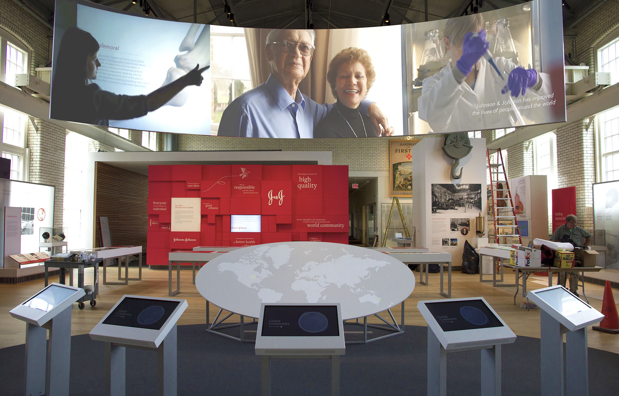
One of the challenging pieces of the project was the global community experience. It spans from mobile web to a multi-user, spatial exhibit. All instances share the same core experience, navigation, and content.
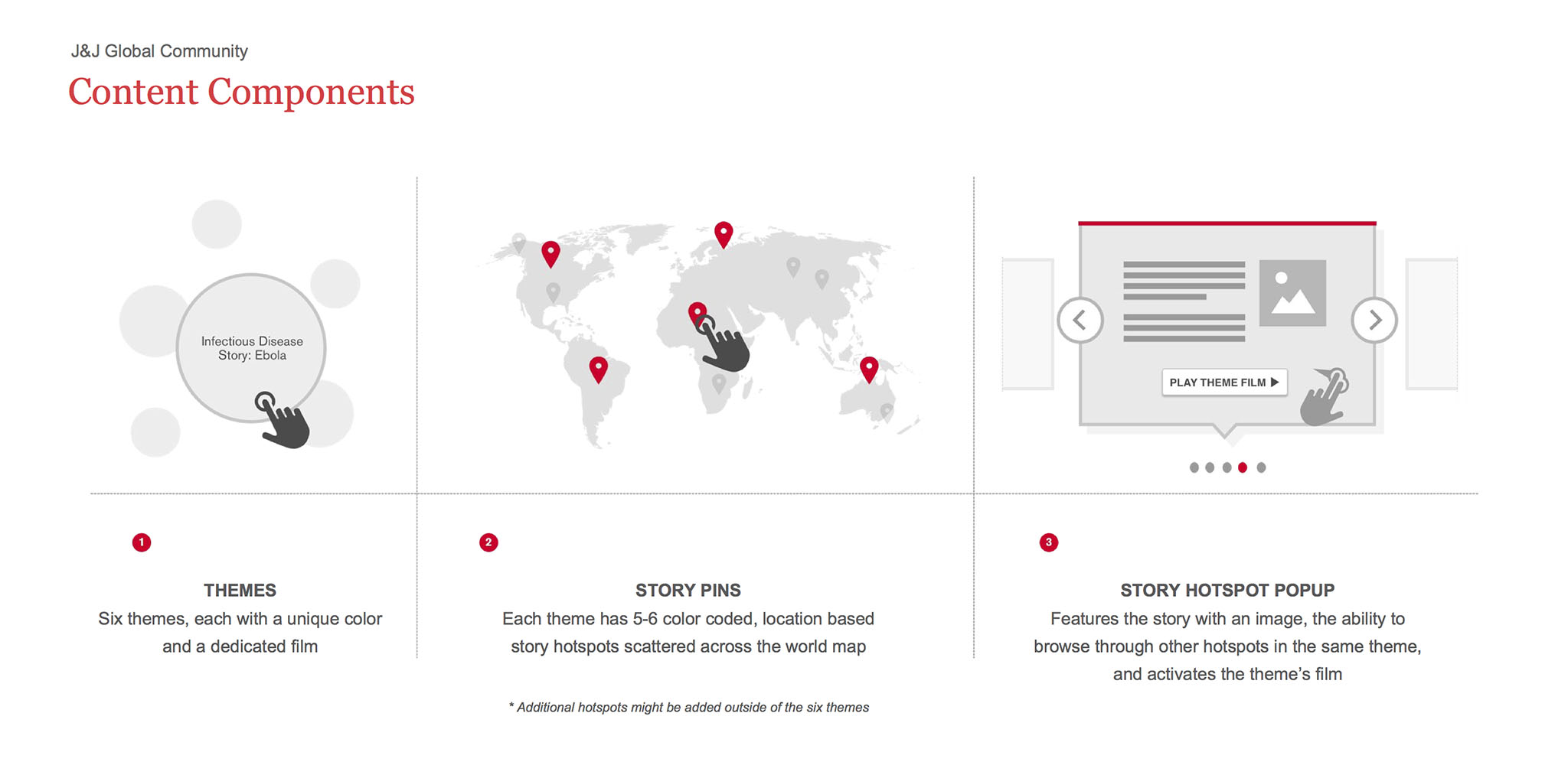
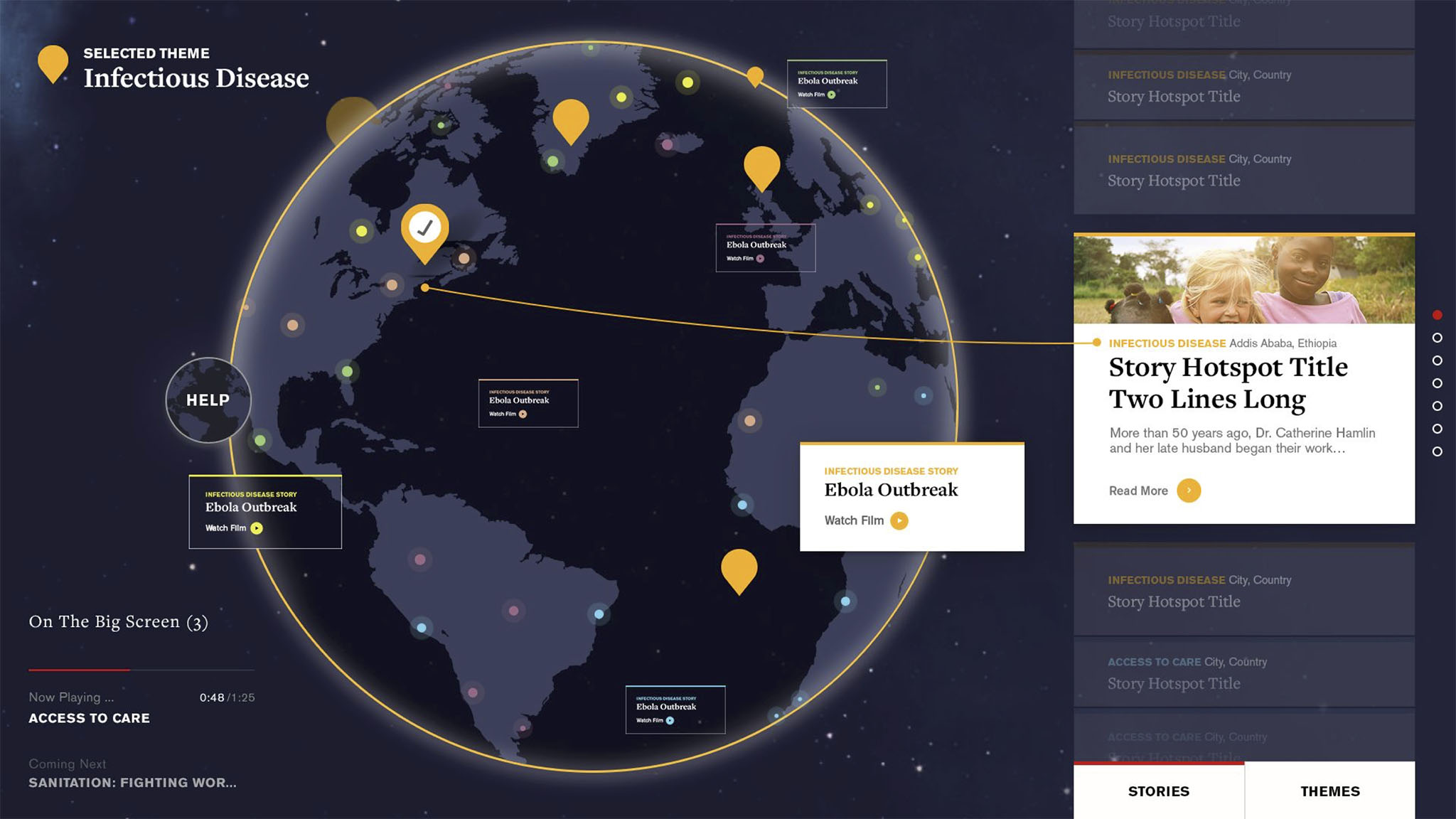
Global Community is an interactive group experience that illustrates the worldwide reach of J&J by highlighting the connections between various locations, initiatives, and communities.
The onsite experience combines five individual touchscreens, a world map projection, and a curved ultra-wide screen. Visitors browse curated video narratives and queue their selection to play on the large screen for a cinematic presentation.
Wireframes - platforms integration
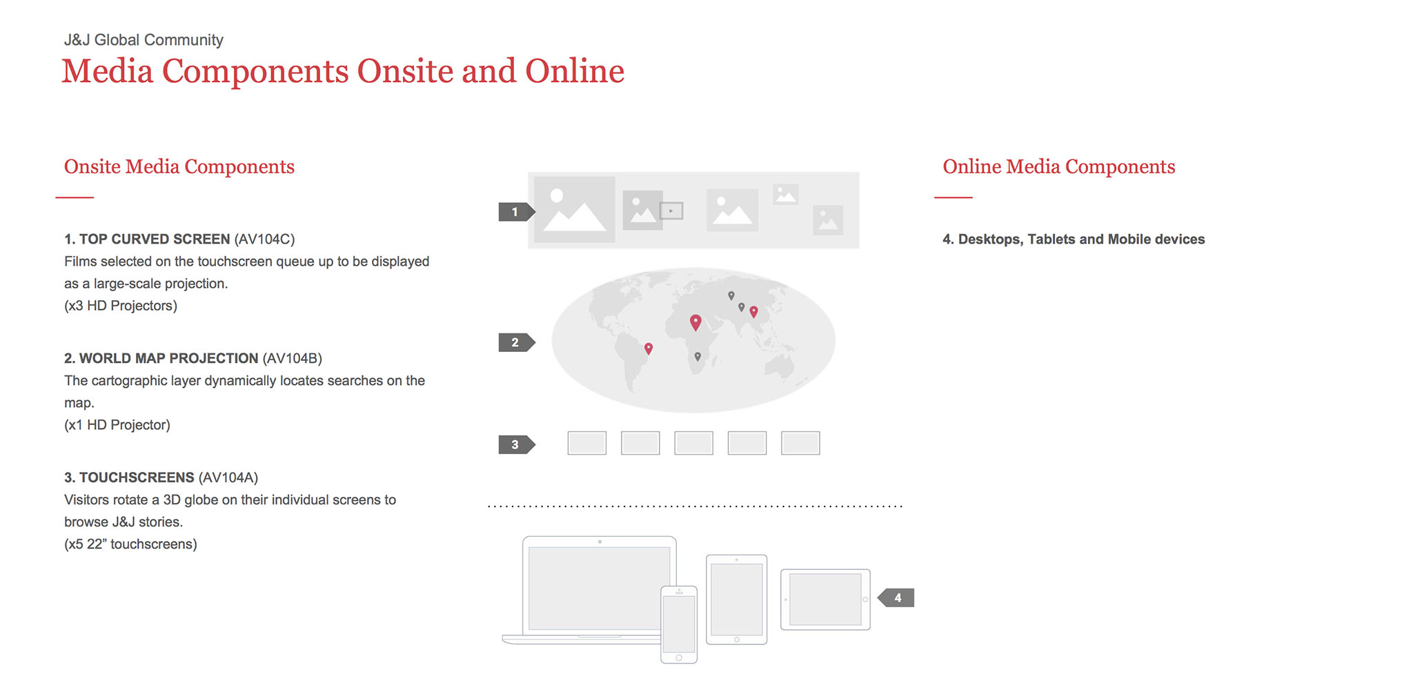
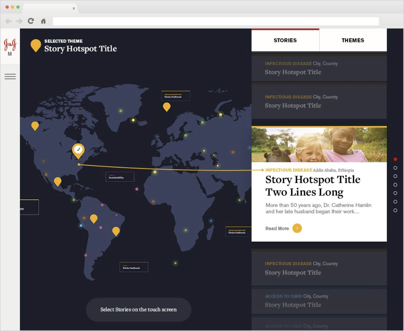
The web experience parallels the onsite experience and features the same essential navigation and video content in a responsive web context.
DESIGN CHALLENGES
- Design for responsive web (3 breakpoints) and a multi-user physical setup (‘the 4th breakpoint’)
- Guide user attention between multiple focal points in a spatial setup
- Create a sense of a shared connection between multiple users
USER FEEDBACK CHALLENGE
When testing the physical exhibit setup it was evident that users are lacking context and feedback to connect their individual interaction to other users and the large cinematic screen. Part of the challenge was about directing attention from a personal screen to a large overhead screen and an understanding of the process of sending video content to the large screen.
The initial solution was based on notification similar to typical mobile UI pattern to inform users about other uses actions and content to be played on the large screen.

This solution improved awareness but was lacking the context of the environment and the connection to the other screens. I then looked into adding literal animation that flows from the individual screen through the world map projection and into the cinematic screen. This enticed uses to track this animation and have clear feedback on the results of their actions and where they are displayed.
Animation and iconography proved to be easier and clearer than any verbal cue and provided the necessary spatial awareness.
FINAL DESIGN
The core experience and content had to retain across all devices and screen sizes, including large touch screens and touch tables. All the different instances and break-points are based on the same CMS and feature identical content across all platforms.
Some design patterns were modified for the large installation screens to accommodate specific physical traits of touch-interaction at these scales, and for multi-screen, multi-user scenarios.
Exhibition and Media Design: Gallagher & Associates
Software Developer: Synechron
Link: ourstory.jnj.com/